Border effect with mask-image
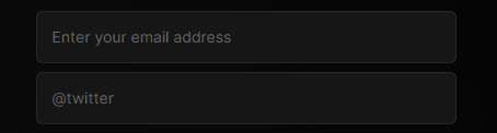
I came across this pretty neat effect on a signup form and thought it might be fun to recreate.

The essential idea here is to mask out the element's border with the mask-image CSS property. However, we can't apply the mask to the element itself or the whole element would become invisible when not hovered, so we need a separate element to work with. Let's use the ::after pseudo element. Pseudo elements don't work on inputs so we'll need to put our input in a wrapper.
.wrapper {
  position: relative;
  display: inline-block;
}

.wrapper::after {
  content: '';
  position: absolute;
  left: 0;
  height: 100%;
  width: 100%;
  border: 2px solid #d6186d;
  border-radius: 4px;
  pointer-events: none;
}
That gives us a nice pink border created using a pseudo element.
Since the effect depends on the mouse cursor's position, we need to keep track of that. We also need to offset the cursor's position against the element the effect should apply to, so that the top left corner of the element is the origin (0, 0). We can use getBoundingClientRect for that. If you're using React, this hook will do the trick.
const useMousePosition = () => {
  const [mousePosition, setMousePosition] = useState({ x: 0, y: 0 });
  const ref = useRef();

  useEffect(() => {
    const updateMousePosition = (ev) => {
      const rect = ref.current.getBoundingClientRect();
      setMousePosition({ x: ev.clientX - rect.x, y: ev.clientY - rect.y });
    };

    window.addEventListener('mousemove', updateMousePosition);

    return () => {
      window.removeEventListener('mousemove', updateMousePosition);
    };
  }, []);

  return {
    mousePosition,
    ref
  };
};
The next step is to hide parts of this pseudo element using mask-image set to a radial-gradient centered around the cursor's position.
The mask-image property works by blocking out the parts of the element where the image is transparent. CSS-Tricks has a good article on mask-image.
To illustrate, below is an element with a black background and a mask set to a radial gradient going from 1 to 0 on the alpha channel, following the cursor's position. You can change the width and height of the gradient to see how that affects the mask.
Next, we apply a gradient mask like this to our pseudo element:
.wrapper::after {
  [...]
  mask-image: radial-gradient(var(--ellipse-x) var(--ellipse-y) at var(--mousePositionX) var(--mousePositionY), rgba(0,0,0,1) 45%, rgba(255,255,255,0));
}
For the input's focus state, we can simply remove the mask and use the bordered pseudo element as the focus outline. This is a great use case for the :has() pseudo class.
.wrapper input:focus {
  outline: none;
}

.wrapper:has(input:focus)::after {
  mask-image: none;
}
And that gives us our finished element with an interesting border effect.